When some people think of a styleguide or a design system, they automatically think of the MailChimp Pattern Library (also sometimes referred to as the MailChimp Styleguide).
One common misconception is that your own design system must closely mimic the scope, style, and public presentation of MailChimp’s.
This is simply not true.
I have written before how each design system is special. It should be just the right size and the right fit for your organization.
For the sake of an argument, let’s take a look at what is working well in MailChimp’s Pattern Library.
In Nathan Curtis’ medium article Design System Doc Components, he lists 8 of his top reusable components to use in your own library.
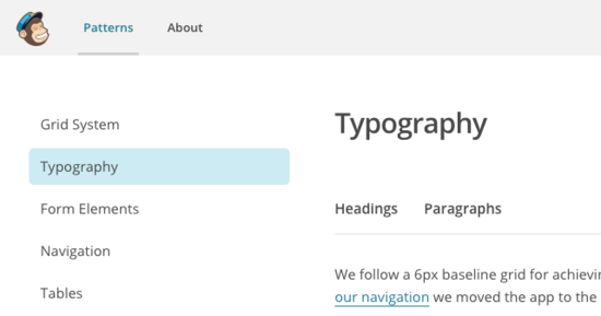
#6. Page-level table of contents
On the left side of the page they list out each of the components. It is simple to navigate and is visible from the top of every page. They also have a sub navigation that is below the headline of each page making it quicker to get to the specific component you are looking for.
Nathan suggests two other features in his article.
- Make the navigation sticky (always visible)
- Reveal a sub-menu in the main navigation, but only when the main section is selected.
I agree with his approach. These two changes make it faster to navigate regardless of your position on the page. The sub navigation being integrated keeps the nav simple and in context.
Tomorrow I will talk about 2 other reusable components that MailChimp is using in their pattern library.