As I am preparing for Contentful certification I have been trying to go more heavily through the documentation and run some of their demos. I came across the contentful-cli command contentful guide from a video titled, “A web project in 5-minutes using the Contentful CLI” from the bits and bytes video series. It sounded compelling to me so I dove right in.
First off, the video content is not in line with what the guide produces. Now it produces a blog complete with a content model, some demo content and images, and a complete Gatsby (React) blog, which is fantastic. The only problem is in didn’t work for me. I got several different errors trying to run the command.
First it merged changes into an existing space that I had created as a demo. Effectively ruining that space. Not great.
Then when I ran it again, I got a 404 error on the api when updating space. However, the command it gives works fine when run alone.
So that leaves you with the problem of how to configure the rest. Here is what worked for me:
contentful login
contentful space create --name 'Gatsby Starter Blog'
contentful space seed --template blog --space-id 354m1vhdmt3g
git clone https://github.com/contentful/starter-gatsby-blog.git
cd starter-gatsby-blog
npm install
mv .contentful.json.sample .contentful.json
From there you need to configure the .contentful.json with the space id from above (an example, use the space id you get from the create command). And then you can get the API key by opening your space in the Web App and navigating to the Setting menue, then under Space Settings, choose API Keys. Once this is done you can start the server with npm run dev and otherwise continue to configure to deploy to Netlify or Heroku.
Hope this saves you some time if you are checking out contentful and you get some errors from the contentful-cli as well.
In fast moving web projects, the design review is an important part of the cycle. This is the place where the design team takes a look at a beta version of the product. And then they document everything that is not inline with the brand or design intent of the project. This can happen at the end of the release. But it is more effective when it happens at the end of each development sprint.
Aurélie Radom suggests,
“carry out this exercise live with the developers so that the designers can challenge the integration, and sometimes improve the design during the project”
The ‘Design Review’ Between Designers and Developers by Aurélie Radom1
Yet, not every team can get buy-in for a direct meeting. This means that as a designer one might be relegated to using something like Jira. And you are stuck with this to document all the things that don’t quite line up.
Jira is a project management and software development tracking tool. It is quite popular in enterprise and agile software development projects.
In this situation you review on your phone, computer. You document issues by taking some screenshots or videos of what you find. Later you enter all these things into Jira doing your best to explain what the issue is. But there is a problem. These screenshots paired with quick descriptions often don’t provide enough context. This will make it difficult for developers to see what the problem is or may not understand how to fix it.
“as a rule, people don’t like to puzzle over how to do things”
Don’t Make Me Think, 2nd Edition by Steve Krug2
This leads to more and more communication. Worst case is that something could be fixed in a way that is not intended. Developers are not known for being detail oriented when it comes to visuals. So how can we help them out?
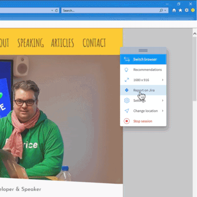
Recently, I have discovered a very efficient workflow for handling a design review. This allows one to document these things, especially if your team is using Jira. It consists of using BrowserStack and Jira using the BrowserStack Integration.
BrowserStack is a paid service that lets you test websites and apps. This includes local development servers. And provides access to many web browsers, operating systems and devices. It is like having a dedicated device library that you can call up and at any time.
Benefits of this workflow
Over a more fragmented process, here are some really valuable benefits to you. And especially the engineers you work with.
You can quickly review in different web browsers that are not the typical ones used by the team. Pro-top you are expected to support them.
You get a consistent way to review and document as an individual and as a team.
You get a consistent way to quickly annotate the issues in the most efficient and minimal way.
Developers will understand the visual errors with less communication. This is due to increasing the consistency of the annotations.
It is faster, especially when documenting many issues
You can review mobile and desktop on any computer.
Very important: it saves the operating system, browser name and version to the image added. This will greatly speed the time to replicate the same issue.
Developers can use the same system to get the same results. No more, “it’s working on my machine.”
Setting up the integration
Setting up the integration should take about 3 minutes.
Go to BrowerStack and then to Settings
Then click on Integrations
Add The Jira integration.
Connect it to your team’s Jira account.
You won’t see anything different yet. But when you click on the report a bug icon you will be presented with an option for report a bug using Jira. Be sure to checkout the official docs for more details.
How to conduct the review (either solo or with your team)
First it is worth considering what are the goals of the design review. Aurélie Radom suggests that goal is a
“review of the developed project which helps to verify that all graphic and technical components display and function properly. This takes into consideration all devices currently on the market, using the most recent OS versions.”
The ‘Design Review’ Between Designers and Developers by Aurélie Radom3
I would expand on this to say that you should have access to the most common devices used on your app. As well as the oldest versions work as minimum requirements to use your website or app.
Your development team should be able to help you out with compiling that list.
The process
Use a browser you don’t always use in development. If you use chrome mac, pick windows firefox. If you have an iOS phone, use an android one.
Review the feature through the “happy path.” Click through the expected process in the simplest fashion. This is likely how it thought about by the developer.
When you find a visual error, immediately click on report bug. If you are tracking to a specific Task, then just search for that one and quickly annotate where the error is. I had trouble typing in the number of the bug or task, so you might want to remember some details of the title.
The most efficient way is to just grab the free form drawing tool and highlight simply where the error is. If you need more context, grab the text tool and write a few words of what is wrong.
Wrong font size, more space, wrong color, or missing information. One of these might provide enough context to make it super clear.
Or if you are reporting as sub tasks or bugs to fix, create a new one. The process is pretty much the same.
Repeat step 3 but try some unconventional ways to use your app, some suggestions below.
Creative ways to stress test your design
This is by no means exhaustive, but to give you some ideas of how you might put your design through the paces. And with the addition of a tool like BrowserStack. Doing some of the following might shake out some harder to detect visual or UX issues with the interface.
Use a very small screen (1024×768) on desktop.
Create the most crazy edge case possible with your feature
fill the screen (can you scroll everywhere and it is still usable).
Rotate the device for mobile.
Try a tablet.
Delete things and go through in every way imaginable.
Try to break things, think of how you could cause the interface to not work correctly.
Delete all of the text.
Use the keyboard only.
Click forward and back on the browser.
In conclusion
To wrap things up, the design review can be a valuable to both the designer and the developer. It allows one to see how close to the original design intent and user experience you got. If you are already using Jira and BrowserStack in your process, then using the this integration can make things go smoother. If you are not using BrowserStack, it is worth considering it. Imagine the speed in which you are able to not only identify cross-browser bugs, but also have your engineers replicate and correct them.
It is not your responsibility to turn developers into designers. But remember they will develop in design literacy. Your interactions and comments about how they interpret your designs do have impact.
“If you want to learn to create great design yourself, if you want to gain design literacy, there simply is no way to do so with lists of rules. Instead, I want to provide you with a new set of eyes through which you can see the world anew.”
Design for Hackers by David Kadavy4
Be an awesome teammate and help your developers learn to see your project with new eyes.
Hello and welcome to this page. What follows is a 3 part email course that used to live as an email course behind DesignSystemsCrashCourse.com (now dead).
It has been featured on podcasts such as Python Talk, Freelancers Podcast, and UI Breakfast. I believe there is still a lot of value in the material, so I am making it available for free. If you are a designer or a developer who is new to design systems or UI component libraries, this can be a great starting point not only for getting some traction on the project, but learning how to sell it to management.
And on to the first email…
What follows in this course two actionable things you can do right now to realize huge savings in your project.
Before talking about those ideas, I wanted explain what the benefits of using Design Systems Engineering in your project.
Foster better communication
Play to your team’s strengths
Avoid conflict between teams (such as Design vs. Engineering)
Produce a better quality product
More design consistency
Less meetings
Yes, and that last one is no doubt going to save you headache and your organization money.
So this all sounds great, but how are we going to get there?
We are going to get there by creating a set of communication tools that allows interdisciplinary teams to quickly and clearly communicate their ideas or reference how something should be done.
This is no easy feat since teams often have objectives that overlap and perhaps agendas that can conflict with one another.
Let me illustrate this point with an example of how web development was done in the past (and continues to this day).
The design teams supplies the engineering team with a set of photoshop high fidelity mocks. There is a large meeting to discuss what each mock is and little details and nuances of how the interface is supposed to work. The engineers take notes based on this ephemeral conversation and return to their lair to hammer out the project.
Then there are the questions…
Hey, is this button is a different size? What color is this grey? How far is that spacing? Why is it 17px here and 19px there? Where are the icons?
And so the back and forth between design and engineering starts. It tends to be very detail oriented based on whatever template engineering decided to start with.
Even this decision is one that has a huge divide between the two teams. Design probably wants to see the most visually stunning page (often the home page) finished first, while engineering focuses on the page with the most complexity first, paying no attention to aesthetics.
And so, how are these questions answered typically?
Meetings, meetings, and more meetings. Designers talking to engineers. Pair sessions with designers sitting with the engineers.
And this is compounded because rather than going through the entire project looking for inconsistencies it is often approached in a template-by-template way.
This is a terribly inefficient process. The only way that products end up hitting that professional level is just a matter of throwing a huge amount of time and energy at it.
Eventually the project is complete and everyone has gotten everything to fit.
But the final site might not resemble the original designs exactly and vice versa.
Likely there have been some changes along the way and the only thing keeping your process together is the verbal history of your tribe.
If the unthinkable happened, and you had to start over with a completely new team, it is unlikely that anyone could decipher the mocks and the final project and figure out what had been done.
I am here to tell you that there is a better way. And that better way is Design Systems Engineering.
Perhaps you have heard of Design Systems and even seen a few on the web. Perhaps you even have implemented (more or less successfully) a set of Design Systems at your own organization.
First off I want to dispel a myth.
A proper Design System for your organization does not need to look like the style guides published by MailChimp, Salesforce Lightning or Google Material Design. These are all beautiful, but they are just examples of how these organizations publicly share or draw attention to their process.
In a recent talk by Jina Bolton of Salesforce she said that, “Design Systems contain whatever your organization needs to communicate design decisions.“
In my experience there are two ways to get started with creating a Design System that will work for an organization of any size. Even a web team of one.
These are 1. front-end code and 2. a living styleguide.
Both of these are what I like to call low hanging fruit. This means that you will be able to build these the fastest, with the least amount of effort, and they will have the biggest rewards.
In the next email I am going to talk about what I mean exactly in regards to front-end code, what my process is, and how this is going to help your team.
Until tomorrow.
-James Stone, Design Systems Engineering – ZURB Foundation Specialist
P.S. A little bit about me. My name is James Stone and I am an independent Design Systems Engineer and an Adjunct Professor at the College of Arts and Architecture at Penn State. For the past 4 years I have worked with diverse design and development teams on a variety of fast-paced projects. In these projects there is always the same goal: to bring world class level products to life in a short time frame. If you would like to learn more, a good place to start is my Featured Articles + Talks Page.
UPDATE 2019: I am now working as a Senior Software Developer at Futurice and the best place to learn more about me is on my personal website at JamesStone.com
Get Started with Frontend CSS Frameworks using Python and Django
Getting started with a CSS framework can be a daunting task. There tends to be a lot of information, a lot of details, and a lot of emphasis on complicated frontend tooling.
Sometimes all you need is a quick way to start quickly, with a step-by-step guide that is specific to the language you working with. In this guide, I give you some insight into the strengths of each framework, and then show you step-by-step how to implement it with Python.
Although these techniques are largely language and platform independent, specificity to Django and Python will be used.
Bootstrap – A safe bet for Devs
One of the most popular frameworks and for good reason. It is developer friendly, has great documentation and looks designed right out of the box. Better yet, grab a theme (free or commercial) and you could be close the look you want right out of the gate. Perfect for teams working on MVP or v1 web apps or personal projects.
One of the favored frameworks of visual designers and projects that have strong visual brands, ZURB Foundation is one of the most popular. Just like a real “foundation” the goal is to build your visual design upon a robust set of starter components that are largely unstyled. This allows you to form the framework into any sort of visual design without having to reinvent the wheel or start from scratch.
With the adoption of flat design and material elements, Bootstrap has become much more minimal in its design opinion. UIKit brings that opinion back with strong visual decisions, slick animations, and a more polished look out of the box. If the style is close to the look and feel you are looking for, UIKit might be a good fit for your team.
Talk Python Episode #137: Design concepts and tips for developers
This resource was created by James Stone as a resource for python developers and the audience of the TalkPython[‘podcast’]. I have included an embed of the episode below for context or you can visit the official episode page.
Choosing the right framework for your next project or to guide your team is no daunting task. Here are a few resources to help guide you in your research journey:
There are basically 3 methods to getting started with Bootstrap quickly with Python. I will use Django as the basis for the example, but the same principals apply if you are using another framework such as Flask. NOTE: I am showing how to install and use Bootstarp vs 3.3.7 the last stable release version. If you follow the official docs you will be prompted to install the beta version, 4.0 which I wouldn’t suggest until it is out of beta and tested.
Method 1: CDN based simple link
By far the most simple to use method to get started with Bootstrap is to add the CDN to your main templates. Not only is this easy to implement on any project, but you can also use tools such as CodePen or JSFiddle to prototype components, test things out or work on your frontend code in isolation.
Copy and paste the following into the head section of your html template:
Ideally what you want to do is have a more complete base template that you use for your project. Here is an example using the above CDN references as a complete template, extrapolated from the Bootstrap Official Docs.
<!DOCTYPE html><html lang=”en”><head><meta charset=”utf-8″><meta http-equiv=”X-UA-Compatible” content=”IE=edge”><meta name=”viewport” content=”width=device-width, initial-scale=1″><!– The above 3 meta tags *must* come first in the head; any other head content must come *after* these tags –><title>Bootstrap 101 Template</title><!– Bootstrap –><link rel=”stylesheet” href=”https://maxcdn.bootstrapcdn.com/bootstrap/3.3.7/css/bootstrap.min.css” integrity=”sha384-BVYiiSIFeK1dGmJRAkycuHAHRg32OmUcww7on3RYdg4Va+PmSTsz/K68vbdEjh4u” crossorigin=”anonymous”><link rel=”stylesheet” href=”https://maxcdn.bootstrapcdn.com/bootstrap/3.3.7/css/bootstrap-theme.min.css” integrity=”sha384-rHyoN1iRsVXV4nD0JutlnGaslCJuC7uwjduW9SVrLvRYooPp2bWYgmgJQIXwl/Sp” crossorigin=”anonymous”><!– WARNING: Respond.js doesn’t work if you view the page via file:// –><!–[if lt IE 9]><script src=”https://oss.maxcdn.com/html5shiv/3.7.3/html5shiv.min.js”></script><script src=”https://oss.maxcdn.com/respond/1.4.2/respond.min.js”></script><![endif]–></head><body><h1>Hello, world!</h1>
<script src=”https://code.jquery.com/jquery-3.2.1.slim.min.js” integrity=”sha384-KJ3o2DKtIkvYIK3UENzmM7KCkRr/rE9/Qpg6aAZGJwFDMVNA/GpGFF93hXpG5KkN” crossorigin=”anonymous”></script><script src=”https://cdnjs.cloudflare.com/ajax/libs/popper.js/1.12.3/umd/popper.min.js” integrity=”sha384-vFJXuSJphROIrBnz7yo7oB41mKfc8JzQZiCq4NCceLEaO4IHwicKwpJf9c9IpFgh” crossorigin=”anonymous”></script><script src=”https://maxcdn.bootstrapcdn.com/bootstrap/3.3.7/js/bootstrap.min.js” integrity=”sha384-Tc5IQib027qvyjSMfHjOMaLkfuWVxZxUPnCJA7l2mCWNIpG9mGCD8wGNIcPD7Txa” crossorigin=”anonymous”></script> <!– HTML5 shim and Respond.js for IE8 support of HTML5 elements and media queries –></body></html>
Method 2: Download Static CSS and JavaScript files
Now all you have to do is copy the important bits into your static files directory. Once there you simply need to create a template similar to step 1, but replace the URLs from from Method 1’s template above, using URLS that are specific to your server or dev environment.
Don’t forget you will also need to download and link to jQuery and Popper libraries for Bootstrap to function correctly.
Method 3: Use Sass and Modern Frontend tooling
This is perhaps the most advanced and most difficult approach to getting Bootstrap into your Django app. It is also the most powerful, and is most suited to large team projects where organization of Sass / CSS into files, mixins, and variables are critical for your workflow.
Bootstrap does not come with a default set of proposed tooling, so my recommendation is to follow the excellent tutorial, Creating a Custom Bootstrap Build with Scss by Trey Hunter on Code Mentor.
Guide to Getting Started with ZURB Foundation + Python
There are basically 3 methods to getting started with ZURB Foundation quickly with Python. As a special note, ZURB Foundation typically needs to have a design placed upon it, so it will look the “least designed” out of the box. However, if you plan to work with visual designers and have a strong visual brand for your app, this is your best choice. I will use Django as the basis for the example, but the same principals apply if you are using another framework such as Flask.
Method 1: CDN based simple link
By far the most simple to use method to get started with ZURB Foundation is to add the CDN to your main templates. Not only is this easy to implement on any project, but you can also use tools such as CodePen or JSFiddle to prototype components, test things out or work on your frontend code in isolation.
Copy and paste the following into the head section of your html template:
Note about older version above: the most recent version of the Official ZURB Foundation Docs states that the current version is 6.4.3. In the example above I have used the last stable version of 6.3 because they have introduced a non-standard grid syntax called the XY Grid. Although it is a very interesting abstraction of flexbox and allows you to control the vertical nature of the grid, the syntax and concepts are more complex that the other two frameworks listed. Version 6.3 uses the Flexbox Grid which has many of the same features and an easier to understand syntax.
Ideally what you want to do is have a more complete base template that you use for your project. Here is an example using the above CDN references as a complete template, extrapolated from the ZURB Foundation Official Docs.
Method 2: Download Static CSS and JavaScript files
Once you have decided that ZURB Foundation is ideal for your project, and you are not quite ready for the complexity of their front-end tooling yet, downloading static files is a good way to go. ZURB Foundation has several different ways to accomplish this via their Official Download Page. Complete which has everything (all options on), Essential which is a lighter version (in file size and also features) and Custom, which is unique to the ZURB Foundation Framework.
As noted in Method 1 above, the most recent version of ZURB Foundation 6.4+ enables the XY Grid by default. It is my recommendation that you default back to the Flexbox grid which has a easier to learn and understand syntax.
Under Grid: you want to select the radio button called “Float Grid”
Once you have made that change scroll to the bottom and click the “Download Custom Build”
As a side note, you can come back to this page at any time, remove or add components, change colors and other settings, which gives you some of the power of Sass, but in an easy to configure method. If you end up need to tweak one of these settings, you can just open up this page again, make your changes, and download a new set of files.
├── css│ ├── app.css <– your custom CSS styles│ ├── foundation.css│ └── foundation.min.css <– ZURB Foundation’s CSS├── index.html <– Starting point for your base template└── js ├── app.js <– ZURB Foundation is instantiated + Your own JavaScript └── vendor ├── foundation.js ├── foundation.min.js <– ZURB Foundation JavaScript ├── jquery.js <– Required └── what-input.js <– Also Required
As compared to the same process for Bootstrap in Method 2 above, you will see that ZURB Foundation provides a complete static file starter project. What you need to do is to copy the important files to your static files and make adjustments to your index.html as a base template for your Django app.
ZURB Foundation tends to be more opinionated about process and tooling (as I will explain in method 3) so you will see that there are two files generated to be modified in your project. ~/css/app.css is for your custom CSS styles and ~/js/app.js starts the JS part of the framework and acts as a home for your project JavaScript. This is apposed to the hard coded <script> tag from the template above from Method 1. You can change this structure, but if you use ZURB Foundation across a lot of projects (or plan to) it can be useful to leave it in a similar state so it matches up with the rest of the official docs.
Method 3: Use the ZURB Foundation frontend tooling
ZURB Foundation is well known for its extensive and modern frontend tooling setup. This can both a pro and a con. This sometimes happens at the expense of documentation on easier to use methods (described above), but it is the only framework that has such an extensive toolset at your disposal.
The easiest way to get started with the 2 starter projects is to install the ZURB Foundation CLI.
npm install -g foundation-cli
Once this is done you can access the CLI without any options other than new.
foundation new
Here is what you will be presented with:
? What are you building today?❯ A website (Foundation for Sites) <– you want this in all casesA web app (Foundation for Apps)An email (Foundation for Emails)
? What’s the project called? (no spaces) <– give it a name? Which template would you like to use?❯ Basic Template: includes a Sass compilerZURB Template: includes Handlebars templates and Sass/JS compilers
Basic Template
The basic template provides you with a simple Gulp based Sass compiler with a watcher task that also runs it through autoprefixer. This allows you to avoid using CSS vendor prefixes entirely and gives you a programatic way to support older browsers in this way.
This is the bare-bones way to approach this problem. You can even take this starter project and reconfigure it for either Bootstrap or UIKit by updating a few files and updating where the sass files are compiled from. It is certainly worth taking a look at the github repo if you are considering adding something like that to your project.
ZURB (Stack) Template
This is where the real magic happens with ZURB Foundation. The ZURB Template is the internal frontend tooling that the agency ZURB uses on its very own client projects. This is a state of the art approach using an inhouse variation of assemble.io (a static site generator) that comes complete with helper functions that are to help you build frontend code templates. This includes states for navigation based on the current page and repeaters that allow you to simply repeat a block of code several times. {{#repeat 100}} <p>yay!</p> {{/repeat}}
Here is a partial list of some of the features that set the ZURB Template apart:
Browser live reload
Dev and Production modes
CSS Minification
JavaScript concatenation and minification
Style Sherpa living styleguide generator
YML configured Gulp Workflow
Autoprefixer
This is the exact system that I use for building frontend code templates and living styleguides for my own client projects. It is lightning fast, allows you to work on the frontend code in isolation, and even allows you to do advanced things such as stub in data for complex patterns or even repurpose the starter project for Bootstrap, UIKit or your own internally managed codebase.
More…
Guide to Getting Started with UIKit + Python
There are basically 3 methods to getting started with UIKit quickly with Python. As a special note, UIKit will look and feel the “most designed” out of the box and might more fun. However, if have an established or growing team, Bootstrap could be a better choice since more devs will be familiar with the syntax. The deciding factor will be balancing the “more well known” factor against how close UIKit gets you to your final design. I will use Django as the basis for the example, but the same principals apply if you are using another framework such as Flask.
Method 1: CDN based simple link
By far the most simple to use method to get started with UIKit is to add the CDN to your main templates. Not only is this easy to implement on any project, but you can also use tools such as CodePen or JSFiddle to prototype components, test things out or work on your frontend code in isolation.
Copy and paste the following into the head section of your html template:
Ideally what you want to do is have a more complete base template that you use for your project. Here is an example using the above CDN references as a complete template, extrapolated from the ZURB Foundation Official Docs.
Method 2: Download Static CSS and JavaScript files
UIKit’s official docs suggest grabbing the latest release. In this case We are presented with a beta rather than a stable version, so I would recommend defaulting down to the latest stable version. At the time this was written (Nov 2017), this is 2.27.4 and can be downloaded directly from this link.
UIKit comes with a ton of static files, which would allow you to be more selective about which components are loaded or not. In the simplest case you just need the two files marked above as important as well as to download and link a suitable version of jQuery similar to Method 1 above.
These 3 files: uikit.min.css, uikit.min.js and your downloaded version of jQuery should be added to your static files and linked in a base template for your Django app.
Method 3: Integrate either Less or Sass into Django
UIKit provides an out of the box precompiler for Less. You can read the official docs for the details and once that is set up you can either run `npm run compile’ to compile your CSS files or `npm run watch` to have a watcher automatically recompile your Less into CSS in the background everytime a file changes.
Today I ran into an obscure JavaScript error that seemed to only be present on the CMS build. I ran through the usual suspects: trying a few tricks I know, scouring Google and Stack Overflow for a similar answer, and hitting up the GitHub issues on the related projects.
They were all of no use in this case. Many issues seemed similar, but none of the solutions seemed to work.
And an error in JavaScript on the browser is difficult. This is because stops the processing of JavaScript and thus breaks the functionality of your site.
Luckily for this project I had a solid set of front-end code built out. Since the CMS implementation used a common set of build tools and templates, I could quickly find the answer.
But first let me tell you how I learned this technique. Back in my 20’s I used to work as a contractor for Apple telephone tech support in Sacramento.
The single most important takeaway from this job is the idea of isolation.
In their case they applied it to troubleshooting computer hardware, but it can be used for literally anything. I have used it myself in countless other applications, including troubleshooting and fixing automobiles.
The idea is that you want to isolate the issue you are having. On a computer you can do that by removing everything and only connecting the bare minimum. On a website, it is no so easy to disconnect things.
That is where quality front-end code comes in. This allows you to have something that is simple and can be easily isolated.
It gives you a test bed that is decoupled from your working site where you can test ideas and solve any issues that arise. It can then act as a blueprint as you roll the changes back out to your production product.
This gives you efficiency, the ability to use a variety of tools in your troubleshooting process, and to speed up your progress by limiting the number of moving parts.
I wondered what I might have done if I didn’t have the front-end code available.
I suppose I could have continued searching, but I am not sure I would find a solution. I guess I could asked around to see if anyone had the same issue. Or I could tried to fix it by trial and error.
The common thread here is that all of these would have been terribly inefficient and burned a lot of time. Design Systems Engineering if done right, gives you a set of tools to get some of that time back. And, with a lot less uncertainty and stress.
This is what the process looked like instead.
I used a tool called Kdiff 3 which has a nice feature of being able to compare entire directory structures of files against each other. It annotates files that have differences with a red color, which allows you to see which files are different between the two sets. It allows you to also see in each file, what is different and what is the same.
I used this tool to compare my front-end code against my CMS build. I able to identify the offending line of code and quickly patch it. Simple, clean, and easy.
Today while waiting in a line for a buffet, I had a thought. I wondered why they always serve a buffet when there are many people to feed.
Here I was in line with a bunch of professors and hungry grad (and potential grad) students. Everyone was getting hungry and impatient fast.
So I thought back to other similar experiences.
I have been doing a fair amount of traveling lately. Some of the hotels I stay at offer a complementary breakfast. And one popular option is to build a custom omelette.
The process goes something like this…
Would you like an omelette?
Sure.
What would you like on it?
What are the options?
Well… (and they read off a list of possible ingredients in an arbitrary order.) (and you have to wait until they finish.) (not to mention memorize the ingredients you want.)
Then you order.
They take the order back to the kitchen on a piece of paper.
The chef prepares the omelette and it brought to your table._
This works great for one or two guests. But what about when you have 100?
That is when this inefficient process breaks down.
This is similar to custom web development. By not having a proper set of guidelines and processes to drive your project workflow can really slow things down.
Let’s flashback to today, the buffet line example.
Here almost all the decisions have been made for you in advance. All you need to do when you get to the front is pick up a plate and go to the first item.
You only have to ask yourself one question. Do I want this item, yes or no?
There is nothing to memorize. You don’t have to wait for something to be prepared. No crazy list of options to memorize.
While standing in line I realized that this is the superior choice.
All I had to decide was what components, er… food, I wanted on my plate.
This is all because someone smart, the chef, spent some time to think about what patterns I would like to consume. Homemade pita chips. A samosa. Chicken Satay. It wasn’t arbitrary–it was a curated experience.
Build a design buffet for your engineers by creating a system of modular components. With this they can work faster, in parallel, plunking down the right components just as they need them. They should have to make ideally zero decisions. Just do they want the component, yes or no.
The next time you find yourself in a queue for food, put yourself in your developer’s shoes (have some empathy), and dream up that perfect design buffet.


